Nowadays, manga authors (called mangaka) are innovating in new ways when it comes to art styles and techniques, elevating the format to exciting new heights. The diversity in art styles makes each manga unique from the rest, from different inking techniques to different shading patterns to different color palettes, which all affect their stories in different ways. And amidst all this innovation, there are still mangaka who rely on classic, traditional styles that fans have come to love—styles that most often appear in romance, slice-of-life, and shojo series. Here are some of the most popular manga art styles that remain loved around the world, along with examples of each.
5. Realistic
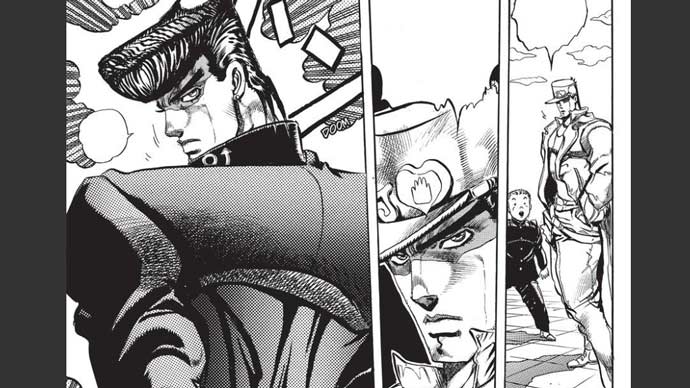
You’ll find many manga with realistic art styles, from ones that take inspiration from real human anatomy to those that pursue geometrically accurate structures inspired by real-world architecture. Realistic art styles aim to make every page, panel, and frame visually appealing in ways that stand out from the more traditional, cartoonish aesthetics of manga illustration. With imagery that feels more true-to-life, the portrayal of emotions in realistic manga art can oftentimes be more impactful without its reliance on usual manga iconography, which elevates the story. JoJo’s Bizarre Adventure is a prime example of the style. Even though the series has an entirely unique illustrative approach, it’s rooted in a realistic style that’s anatomically true (although exaggerated at times). Another great example is One Punch Man, which started off as just some ordinary kid’s drawing but was eventually given a solid manga version with realistic art by Yusuke Murata.
4. Chibi
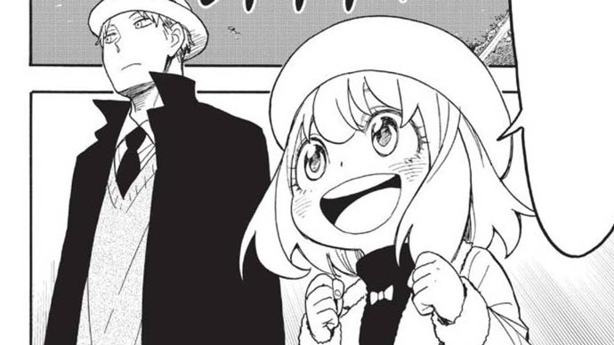
The chibi art style is one that’s immediately recognizable, even by those who don’t really read manga or watch anime. Chibi characters have a few iconic, distinguishing features: a small body with a disproportionately large head that’s soft, round, and complete with equally large, soft, round eyes. In many manga series, most characters might be drawn normally to a specific style while young characters and children are the only ones drawn in chibi style. Anya in Spy X Family is one such example. The chibi art style is also commonly used for comic effect, mainly as a way to defuse tension in a scene, to make a scene less serious, and to make fun of certain characters, ideas, and situations. Lots of spin-off manga series completely change the mood of their original stories simply by switching art styles. If they want the spin-off to be more lighthearted, silly, and funny, they’ll usually go with chibi style. For example, Naruto gets pretty dark in the latter half of its run, but Chibi Sasuke’s Sharingan Legend features serious characters in chibi style doing silly things, like Sasuke and Itachi fighting for a TV remote or Suigetsu and Kisame using their great swords for cooking.
3. Kawaii
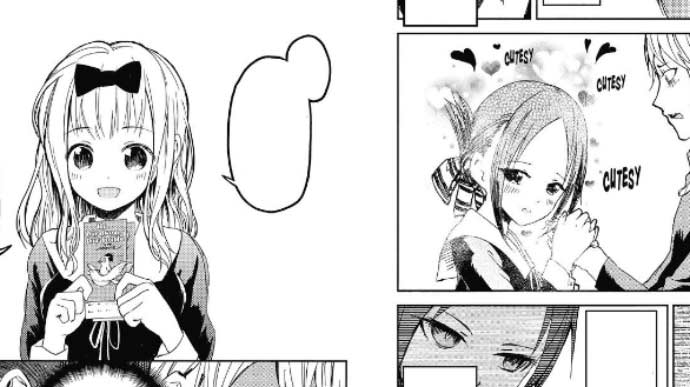
In Japanese, kawaii means “cute.” Many manga series are drawn in what’s called kawaii style, which isn’t meant for comedy (as is the case for chibi art) but for hightlighting the looks and beauty of individual characters. The kawaii art style is unique for its relative simplicity. Character designs aren’t as exaggerated or complex as they are in other manga art styles, making it a go-to style for the shojo, magical girl, and slice-of-life genres. More recently, some mangaka have started incorporating the kawaii art style into other art styles, much like how chibi art is often mixed in with other manga art styles. Kawaii art can appear in shonen and mecha series, often for the purpose of lifting up frames and panels from their dark and intense atmospheres. My Dress-Up Darling and Kaguya-Sama: Love Is War are two popular manga series that feature kawaii art.
2. Colored Pages
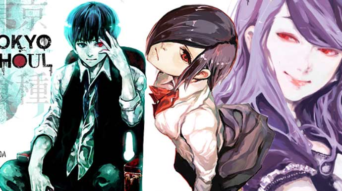
Normally, manga is published in black and white. Lines are drawn thicker and thinner to evoke different effects, and there are many shades of gray thrown in to differentiate between light and dark. But every so often, you’ll run into colored pages—primarily on cover pages, but also the occasional page within a volume. Colored pages are meant to catch your eye and emphasize important scenes. Sui Ishida’s art style in his works Tokyo Ghoul and Choujin X features unique cover pages with artistic applications of watercolor, giving them a gloomy feel that fits perfectly with their dark fantasy themes. The volume covers of Tokyo Ghoul are even more interesting because each character that’s featured on the page is given different strokes of color, depth, hues, and saturations to make them stand out.
1. Disturbing
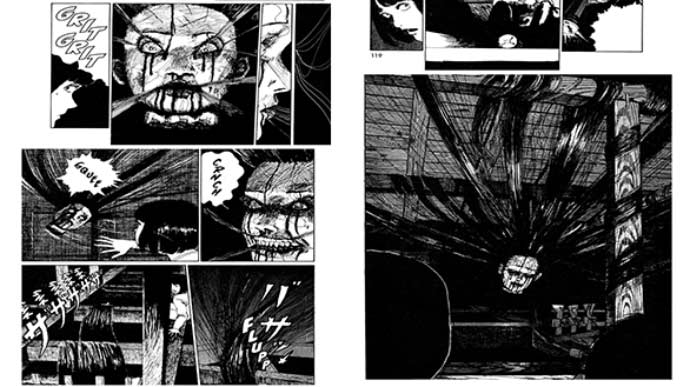
With horror manga, much of the terror comes from the creature designs and the way they’re illustrated—but not only do the creatures need to be scary, the art style itself needs to be creepy, dreadful, and evocative. Mangaka Junji Ito, often cited as the father of horror manga, has a horrifying technique—based on classic manga art styles—that produces truly haunting images that are disturbing to look at. For example, his manga story Uzumaki involves strange spirals that drive people crazy. There’s also The Long Hair in the Attic, which features hair that kills its owner because it doesn’t want to be cut off. These types of creepy stories aren’t drawn in any particularly new way—they’re done in classic manga style with traditional framing, composition, etc. But they emphasize dread in their scenes through bold lines, heavy strokes, and overall darkness. Junji Ito’s artwork is further unique because most of his stories don’t scare using creatures and monstrosities. His scares are rooted in psychologically haunting images and disturbing plot developments.


![]()
